Scott Klein: Wie man ein Team für Datenjournalismus bildet /How to build a data team (dt-engl Version)
Scott Klein leitet ein Team aus Datenjournalisten bei ProPublica in New York. Im Interview mit Julius Tröger und Sylke Gruhnwald erzählt er, wie man ein Datenjournalismus-Team aufbaut.
(Please scroll to find the english original version following the german text)
Info: ProPublica ist eine spendenfinanzierte Investigativredaktion in New York. Immer wieder landen Scott Klein und sein Team Scoops. Zu den bekanntesten Projekten gehören ER Wait Watcher oder Dollars for Docs. Das Datenteam war auch an der Berichterstattung um die Snowden-Enthüllungen beteiligt. Julius Tröger hat 2012 im Rahmen des sogenannten „P5-Stipendiums“ dort gearbeitet. Hier kann man sich dafür bewerben.
Können Sie Ihren Job bei ProPublica kurz beschreiben?
Scott Klein, ProPublica (New York)
SCOTT KLEIN: Der Titel, der auf meiner Visitenkarte steht, lautet „Assistant Managing Editor“. Ich bin verantwortlich für die Bereiche Datenjournalismus, interaktive Grafiken und News-Applikationen.
Designer, Entwickler und Journalisten arbeiten bei ProPublica im sogenannten Nerd Cube zusammen. Wie wichtig ist das kollaborative Arbeiten von Personen aus unterschiedlichen Bereichen im Newsroom und speziell im Bereich Datenjournalismus?
Sie arbeiten nicht nur zusammen – oftmals sind es die gleichen Personen! Jedes meiner Team-Mitglieder ist bei seinem jeweiligen Projekt sowohl verantwortlich für den journalistischen Inhalt als auch für das Design und den Code. Sie arbeiten natürlich zusammen mit weiteren Kollegen. Allerdings bin ich der Meinung, dass das bestmögliche Ergebnis für eine Geschichte erzielt wird, wenn eine Person das Ganze im Blick behält, sprich: Inhalt, Design und Code. Normalerweise führt nicht ein Reporter die Interviews, ein anderer Kollege übernimmt die Dokumenten-Recherche und ein weiterer Kollege schreibt die Geschichte. Es ist wichtig, dass eine Person die Daten recherchiert als auch diese analysiert, mit Experten spricht und die interaktive Datenbank aufbaut, die dann wiederum publiziert wird.
Wir arbeiten aber nicht nur an unseren eigenen Projekten. Oft kooperieren wir mit Reporter-Kollegen aus dem Newsroom, dann arbeiten wir aber auf gleicher Augenhöhe und nicht als Entwickler, die nur einen Ausschnitt der Geschichte kennen.
Welche datengetriebene Geschichte von ProPublica hatte bis heute den größten Einfluss?
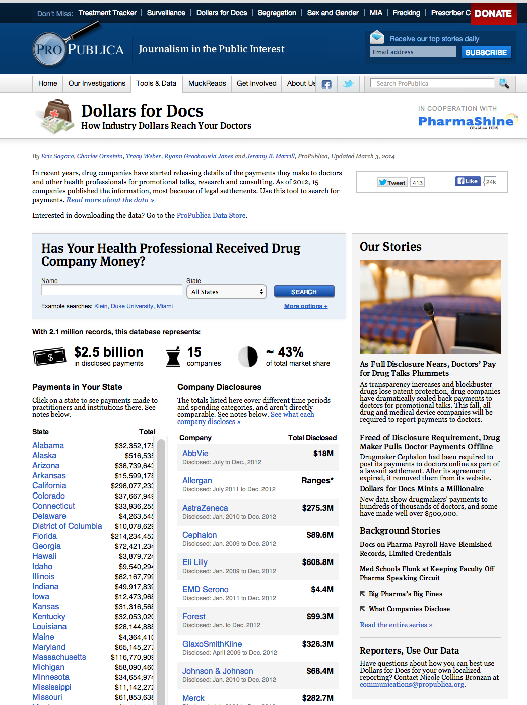
Wahrscheinlich ist das unser Projekt „Dollars for Docs“ . In dieser Recherche untersuchen wir die Zahlungen an Ärzte von 15 pharmazeutischen Unternehmen und ermöglichen unseren Lesern die Suche nach ihrem Arzt und den Zahlungen, die dieser womöglich erhalten hat. Die Datenbank wurde bereits mehr als sieben Millionen Mal verwendet und ist die Quelle für Hunderte von Geschichten quer durch die USA. Zudem bin ich stolz auf unser Projekt „ER Wait Watcher“ . Diese Recherche soll unseren Lesern helfen, die Qualitätskriterien von Notaufnahmen in Krankenhäusern näher zu bringen. Im Fokus stehen die Wartezeiten. Die Geschichte soll ihnen helfen herauszufinden, welche Notaufnahme in der Nähe von ihnen am schnellsten mit dem Auto zu erreichen ist und die kürzeste durchschnittliche Wartezeiten hat – das sind hilfreiche Informationen in einem Notfall!
Was sind Ihre bevorzugten Datenquellen?
Das ist abhängig vom Thema. Wir nutzen eine Mischung aus offen zugänglichen Daten der Regierung (Open Government Data), mit Daten, die wir über das Informationsfreiheitsgesetz (FOIA, Freedom of Information Act) bekommen mit gescrapten Daten von Unternehmen.
TIPP: Das Interview mit Scott Klein ist Bestandteil der 16seitigen Journalisten-Werkstatt „Datenjournalismus„, erschienen im Juli 2014.
Autoren: Sylke Gruhnwald, Julius Tröger. Herausgeberin: Annette Milz.
Wie würden Sie den Arbeitsprozess zwischen Reportern, Designern und Entwicklern bei ProPublica beschreiben?
Unsere Designer und Entwickler sind immer die gleichen Leute. Wir teilen deren Verantwortlichkeiten nicht auf.
Oft arbeiten wir mit Reportern außerhalb unseres Nerd Cubes zusammen. Wir helfen Ihnen dabei, Datensätze zu säubern, zu verstehen und mehr davon zu bekommen. Wir planen dann zusammen, wie man die Geschichte mit einer interaktiven Datenbank erzählen könnte, und stehen den Kollegen während des gesamten Projekts als Fachexperten zur Seite – während wir die News-Applikation bauen. Manchmal sitzen wir in Gespräche mit ihren Quellen und suchen dann nach weiteren Quellen, um sicherzustellen, dass wir die Daten zum einen richtig verstehen und darüber hinaus die analytische Methode verwenden, die angemessen und richtig ist.
Welche Tipps zum Aufbau eines Datenteams innerhalb der Redaktion können Sie unseren Lesern mit an die Hand geben?
Für mich ist das Allerwichtigste, einen Redakteur anzustellen, der Daten versteht, der weiß, wie man ein Team führt, der redaktionellen Standards etabliert und der auch interaktive Inhalte editieren kann. Ein kluger Redakteur weiss, wie ein Team zu fördern ist, kann Prioritäten richtig setzen und Ablenkungen möglichst gering halten. Und sie können helfen, die richtigen Mitarbeiter für das Team einzustellen und talentierte Mitarbeiter in der Redaktion zu halten.
Was das Team betrifft: Man sollte versuchen, Personen mit den unterschiedlichsten Fähigkeiten und Talenten einzustellen – zwei der folgenden drei Dinge sollten sie mindestens mitbringen: inhaltliche Urteilsfähigkeit, ein Gespür für Design und Kenntnisse im Bereich Programmierung. Die Journalistische Urteilsfähigkeit ist die wichtigste und das schwierigste dabei. Programmierkenntnisse sind der einfachste Teil, besonders bei kleineren Projekten. Frameworks wie D3, Backbone, Rails und Django übernehmen viel der härtesten, grundlegenden Teile der Programmierung, und erlauben uns, am journalistischen Teil der Geschichte zu arbeiten, die wir interaktiv erzählen wollen.
Welche Ressourcen (Blogs, Personen, Mailinglisten) würden Sie Anfängern im Bereich Datenjournalismus empfehlen? Welche Quellen nutzen Sie, um sich auf dem Laufenden zu halten?
Wie hat sich datengesteuerten Journalismus Deiner Meinung nach in den letzten Jahren weiterentwickelt?
Vieles, was wir heute tun, wurde uns von Kollegen vor langer Zeit bereits mit an die Hand gegeben. Philip Meyer begann mit sozialwissenschaftlichen Methoden, um die Unruhen in Detroit im Jahr 1967 abzudecken. Die New York Times begann einige Jahre später mit statistische Analyse von Kriminalitätsdaten. Und nochmals davor hat die UNIVAC 1952 Prognosen zu den Ergebnissen der Präsidentschaftswahl in den USA veröffentlicht. Im Jahr 1848 hat Horace Greeley eine investigative Recherche über den amerikanischen Kongress veröffentlicht. All das zeigt: Die Geschichte des Datenjournalismus ist sehr alt. Heute ist neu, dass wir in der Lage sind, der Leserschaft die Rohdaten zu zeigen und, dass in einer Art und Weise, dass sie die Daten verstehen und herausfinden können, was gerade für sie relevant ist.
Wie haben Leaks, wie beispielsweise die Offshore-Leaks und die Veröffentlichung der NSA-Dokumente, den Journalismus und die traditionelle Berichterstattung verändert?
Eines der Dinge, die an den Offshore Leaks und den NSA-Dokumenten neu sind, ist der Umfang. Die Pentagon-Papiere entsprachen einer Menge Material für die damalige Zeit – über 7000 Seiten in 47 Bänden. Aber Chelsea Manning dagegen leakte rund 250.000 diplomatischen Depeschen über das Internet.
Ich möchte auch die Komplexität der Instrumente als auch deren Anwender betonen, die zur Unterstützung der Recherche beigezogen werden. Bei den Offshore-Leaks wurde das ausgefeilte Textanalyse-Instrument Nuix genutzt. Was die Veröffentlichung der NSA-Dokumente angeht, daran haben technische Autoren wie Ashkan Soltani aber auch unser Kollege Jeff Larson eng mit erfahrenen Kollegen wie Bart Gellmann und Scott Schane gearbeitet.
Welche internationalen Geschichten empfehlen Sie?
Ich beobachte besonders genau Wahlnächte in den unterschiedlichsten Ländern, und wer hier Daten wie in der Live-Berichterstattung nutzt: Karten, anspruchsvolle Grafiken, etc. – und das aus zwei Gründen: Erstens werden bei Wahlen oftmals gleiche Systematiken dargestellt, so dass ich die Berichterstattung nachvollziehen kann, ohne dass ich grosse Details über das jeweilige Land kenne – die Darstellung der Wahlkreise, wie viele Sitze im Parlament welche Partei gewonnen hat. Solche Datensätze stehen in der Regel auch dort zur Verfügung, wo es kein Informationsfreiheitsgesetz gibt. Für mich ist die Wahlberichterstattung ein bisschen wie ein Leitbild für die Gestaltung und die Entwicklung in Redaktionen weltweit. Zum Beispiel während der Wahlen 2012 in Frankreich als Hollande den Sieg errang, da schaute ich auf jede französische Nachrichtenseite, die ich finden konnte – Le Monde, Figaro, aber auch Libération und L’Humanité – alle zeigten recht anspruchsvolle Karten mit den aktuellen Wahlergebnissen.
Wahlen bieten auch einen guten Start in den Datenjournalismus. Halten Sie auch ein Auge auf die akademische Forschung. Oft lasen sich dort tolle Geschichten finden und Akademiker ihre Daten sehr gern mit Ihnen. Und manchmal braucht es mehr Intelligenz als finanzielle Mittel – als Beispiel führe ich gern ein der Projekt des South Florida Sun-Sentinel an: Die Kollegen recherchierten, dass die Polizei auch dann zu schnell fährt, auch wenn es kein Notfall ist. Ermöglicht hat diese Geschichte erst die Analyse der Geräte, die die Polizei für das Maut-Zahlungssystem nutzt. Diese Geschichte gewann sogar einen Pulitzer-Preis.
How to build a data team
Scott Klein leads a team of data journalists at ProPublica in New York.
Scott Klein, ProPublica (New York)
Sylke Gruhnwald and Julius Tröger asked him about his advice on working with data in the context of data journalism.
Could you briefly describe your job at ProPublica?
SCOTT KLEIN: My title is Assistant Managing Editor. I am in charge of our data journalism, interactive graphics and news applications.
Designers, developers and journalists work together in your so-called nerd cube. For data journalists, how important is collaboration with people of different backgrounds in the newsroom?
They do not just work together – they are frequently the same people! Each person on my team is responsible for the journalism, the design and the code of their projects. They collaborate with their colleagues, of course, but I find the best journalism comes when one person has ownership and can see the whole picture: the journalism, the design and the code.
Just as you usually do not have one reporter doing the interviews and another one reading public documents and yet another one writing the story, it is important that one person works on the data, talks to experts to understand them, and builds the interactive database that we publish.
We do not just work on our own enterprise projects of course. We also often work with reporters in the general newsroom, but we do so as peers and not as developers who only know one limited part of the project.
Could you describe your workflow at ProPublica?
When we are working with reporters outside our team we try to join the project as early as possible, to get a look at their database, to help them understand it, clean it, get more of it, etc. We plan together what might make a great interactive database that tells an important story, and throughout the project we lean on the reporter to be our subject matter expert as we build the news application. We read as many drafts as we can. We sometimes sit in on conversations with their sources, and develop sources of our own to make sure we understand the data and that the analytical method we want to use is appropriate and applied correctly.
We do not have a lot of “high ceremony” bureaucracy. There is no formal process, just the kind of basics in any newsroom – a story memo, open and frequent conversations, and a shared obsession with getting the facts right and telling a compelling story that represents our readers’ interests.
Which data projects at ProPublica had the most impact?
Perhaps it was our Dollars for Docs project, which collects the payments made to doctors by 15 pharmaceutical companies, and enables people to search whether their doctors receive payments. It has been accessed more than seven million times and has been the source for hundreds of news stories around the country.
But I am also quite fond of our ER Wait Watcher, which helps people understand quality metrics for hospital Emergency Rooms in terms of of wait times — and it helps them find out which ER near them is the quickest to get to by car and has the shortest average wait time, which is extremely helpful information when you are in need of emergency health services.
What are your main data sources?
It varies. We use a mix of open government data, data received through FOIA, and scraped corporate data.
What are your tips to form a new data team within a newsroom?
The most important thing is to hire an editor who understands data, knows how to guide a team, establishes editorial standards, edits the copy and “edits” the interactive user flows. A smart editor can foster a team and keep their priorities set and as well as contain distractions. And smart editors can help recruit and retain talented folks.
For the team, try to hire people with broad talents – they should have at least two of three things: Editorial judgment, design acumen and coding skills. Journalism expertise is the most important, and the hardest to learn on the job. Design also requires some talent. The programming is the easiest part, especially when you are doing projects with limited complexity.
Frameworks like D3, Backbone, Rails and Django all do lots of the hardest as well as the more basic parts of programming, freeing us to write those parts that are closest to the journalistic story we are trying to tell with an interactive data driven approach.
If you have on your staff a talented visual journalist – a graphics or a data visualization expert – who is technical, has good editorial judgment and who cares a lot about being accurate, that is a good place to start. Teach that person how to code and give him or her a project that will really push them to learn. When their first project is a huge success, hire more.
Depending on your newsroom you might also want this person to have basic to intermediate statistics skills: Calculating means, standard deviations, z-scores, etc. are very useful in building visualizations (and they are not hard to do). After a while you will need people with a more extensive background on statistics to help you do more sophisticated analyses accurately.
Which resources (blogs, people, mailing lists) would you recommend for beginners in data-driven journalism? Which ones do you use to keep up-to-date?
How has data-driven journalism in your opinion evolved in the past years?
Much of what we do has been handed down to us by data journalists working long ago. Philip Meyer started using social science techniques to cover the Detroit riots in 1967. The New York Times was doing statistical analysis of crime data a few years later. Even before all of that the UNIVAC predicted the 1952 presidential election in the U.S. Even before that Horace Greeley published an investigative data story about the U.S. congress in 1848.
The history of data journalism is very long. What is new today is that we are able to show readers the raw data, designed in a way that lets them understand the data and find what is relevant to them. So, for instance, your project may let people see and understand the big picture about noise levels at a particular airport but it also lets them look up their own address to see how it might affect them and their communities. A huge amount of data is inside that project and these data are presented in a way that makes people feel empowered and not small.
How have leaks like the Offshore-Leaks and the NSA files changed journalism and traditional reporting?
One of the things that is new about offshore leaks and the NSA files is the scale of the leak. The Pentagon Papers was a lot of material for its time – about 7,000 pages across 47 volumes. But Chelsea Manning allegedly leaked something like 250,000 diplomatic cables via self-created CDs and the Internet.
I would also point to the sophistication of the tools – and the people -brought in to help examine the material. Offshore leaks used sophisticated text analysis tools like NUIX. If you look at the NSA Files stories you will see really technical journalists like Ashkan Soltani and our own Jeff Larson reporting alongside veteran national security reporter like Bart Gellman and Scott Shane.
Which international projects do you recommend (we are particularly interested in those stories that are not big, expensive milestone projects)?
I like to pay attention to election nights, and to who is doing live data reporting – maps, sophisticated graphics, etc. – for two reasons: First, most elections are similar enough that I can understand the basics without knowing anything else about the country such as voting district maps, parliamentary seats won, etc. Also, the data tends to be available even in places where there is absolutely no FOIA tradition (even in emerging democracies, as they are eager to please external election monitors). For me, it is a bit of a bellwether for the design and development aptitude in newsrooms everywhere. For example, in the French elections that brought Hollande into office in 2012, I looked at every French news website I could think of – Le Monde, Figaro, even Liberation and L’Humanite – all had quite sophisticated election result maps.
And remember – if your newsroom can do live election night data, it can do data journalism whenever you like! Everything you learn about how to cover election night with live data and maps teaches you how to do any data journalism project, and to analyze a ton of data.
Another tip: It sometimes takes more cleverness than cash – for instance look at the South Florida Sun Sentinel’s project that caught the police driving way too fast even when they were not responding to emergency calls – all by analyzing the records from the toll-payment transponders in the police cars. That project won a Pulitzer Prize.
Journalist-workshop „Data driven journalism“, by: Sylke Gruhnwald, Julius Tröger
The interview is part of the 16pages special print edition „Journalist Workshop: „data driven journalism“, published by medium magazin July 2014

 Wahrscheinlich ist das unser Projekt „Dollars for Docs“ . In dieser Recherche untersuchen wir die Zahlungen an Ärzte von 15 pharmazeutischen Unternehmen und ermöglichen unseren Lesern die Suche nach ihrem Arzt und den Zahlungen, die dieser womöglich erhalten hat. Die Datenbank wurde bereits mehr als sieben Millionen Mal verwendet und ist die Quelle für Hunderte von Geschichten quer durch die USA. Zudem bin ich stolz auf unser Projekt „ER Wait Watcher“ . Diese Recherche soll unseren Lesern helfen, die Qualitätskriterien von Notaufnahmen in Krankenhäusern näher zu bringen. Im Fokus stehen die Wartezeiten. Die Geschichte soll ihnen helfen herauszufinden, welche Notaufnahme in der Nähe von ihnen am schnellsten mit dem Auto zu erreichen ist und die kürzeste durchschnittliche Wartezeiten hat – das sind hilfreiche Informationen in einem Notfall!
TIPP: Das Interview mit Scott Klein ist Bestandteil der 16seitigen Journalisten-Werkstatt „Datenjournalismus„, erschienen im Juli 2014.